
Pellegrino: New Zealand Edition
Pellegrino assigned a special packaging project to the Pirate Enterprise Design Agency. The task was to design different Pellegrino bottles to represent different countries while maintaining the same label shapes and every bit of the copy currently on the bottle. The design should be based on authentic design elements from the country chosen and may be inspired by architecture, art, the country’s history or the country's culture.
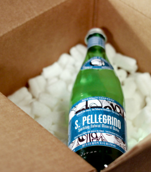
For my Pellegrino bottle I chose to represent the country of New Zealand. One of the major aspects of New Zealand culture that influenced my designing process was Maori art. Maori art, created by the indigenous Maori people of New Zealand, and the shape of the silver fern very heavily influence New Zealand art. Maori art, also called ta moko, is permanent body and face markings that Maori men had done to prove they were manly enough to endure the pain of war. Ta moko was originally carved into the skin rather than punctured with ink. The silver fern symbol is a powerful symbol that represents inspiration, the silver fern was also used by the Maori people who made the leaves of the fern into beds, commonly seen in Maori tattoo art.
In my Pellegrino labels the use of line, form, shape and color are very important. Form is very important in the Maori design process. Inside my labels you will see the shape of the silver fern and very sharp rigid lines. Maori art has very precise angles and straight lines. My color pallet was green-blue, white and black. I chose the design to be black because most commonly Maori tattoos are done in black. I chose the color blue-green because the main color in the New Zealand flag is blue but I also wanted to incorporate the color of the silver fern, which is green. So I blended the two colors to create a teal. I chose the bright blue-green color because I wanted the labels to pop and grab the readers’ eye. The teal stands out more than the rest of the label because the rest of the label is black and white and very detailed.
